nyc: graphic chronicles
TRANSCRIPT
Nu
eva
Yo
rk258 Nueva York:
relatos gráficos
NYC: graphiC ChroNiCles
Hugo Barros Costa
doi: 10.4995/ega.2016.6300
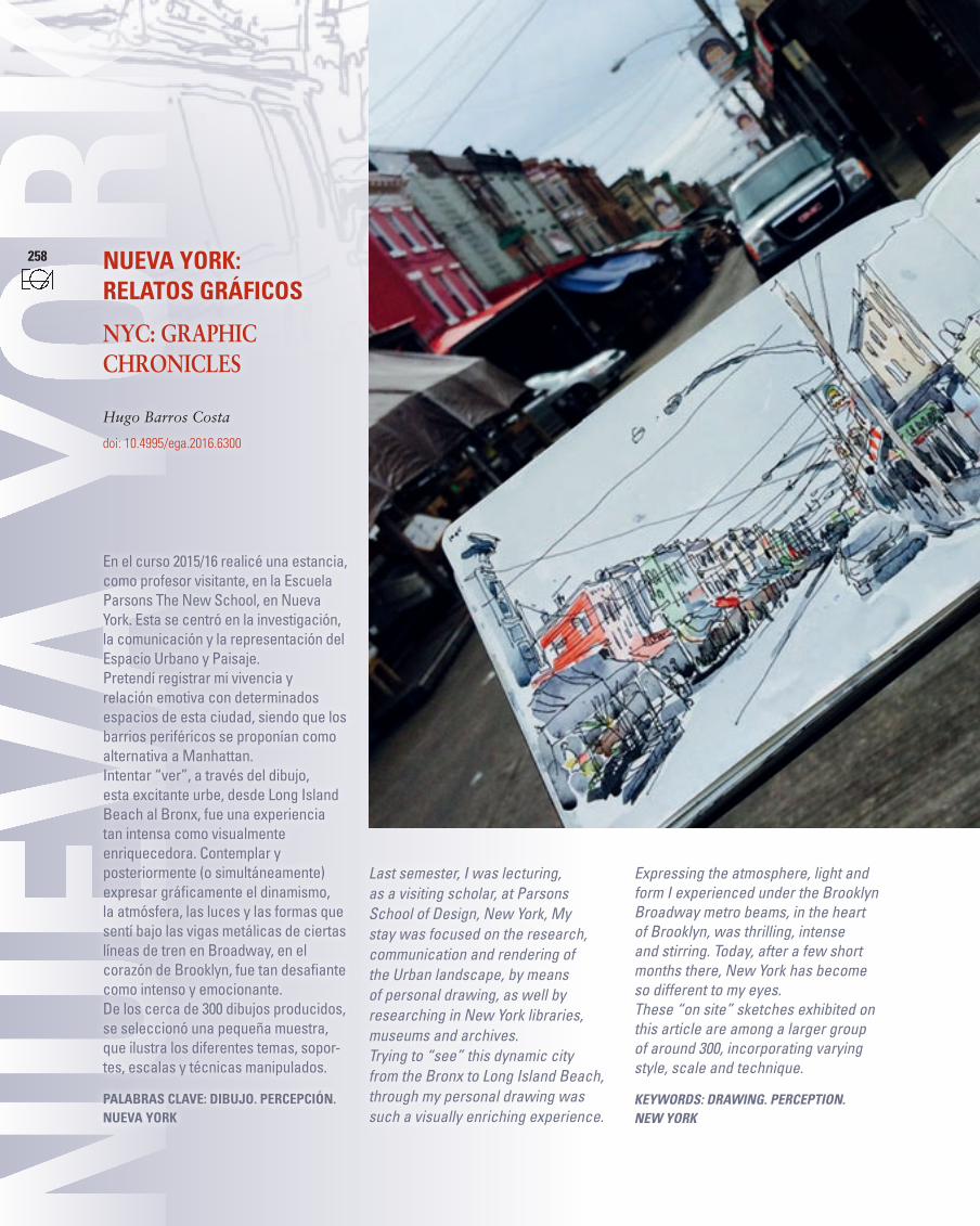
En el curso 2015/16 realicé una estancia, como profesor visitante, en la Escuela Parsons The New School, en Nueva York. Esta se centró en la investigación, la comunicación y la representación del Espacio Urbano y Paisaje.Pretendí registrar mi vivencia y relación emotiva con determinados espacios de esta ciudad, siendo que los barrios periféricos se proponían como alternativa a Manhattan.Intentar “ver”, a través del dibujo, esta excitante urbe, desde Long Island Beach al Bronx, fue una experiencia tan intensa como visualmente enriquecedora. Contemplar y posteriormente (o simultáneamente) expresar gráficamente el dinamismo, la atmósfera, las luces y las formas que sentí bajo las vigas metálicas de ciertas líneas de tren en Broadway, en el corazón de Brooklyn, fue tan desafiante como intenso y emocionante.De los cerca de 300 dibujos producidos, se seleccionó una pequeña muestra, que ilustra los diferentes temas, sopor-tes, escalas y técnicas manipulados.
Palabras clave: Dibujo. PercePcióN. Nueva York
Last semester, I was lecturing, as a visiting scholar, at Parsons School of Design, New York, My stay was focused on the research, communication and rendering of the Urban landscape, by means of personal drawing, as well by researching in New York libraries, museums and archives. Trying to “see” this dynamic city from the Bronx to Long Island Beach, through my personal drawing was such a visually enriching experience.
Expressing the atmosphere, light and form I experienced under the Brooklyn Broadway metro beams, in the heart of Brooklyn, was thrilling, intense and stirring. Today, after a few short months there, New York has become so different to my eyes.These “on site” sketches exhibited on this article are among a larger group of around 300, incorporating varying style, scale and technique.
Keywords: drawing. perception. new yorK
259
expresión gráfica arquitectónica
ObjetivoEl objetivo de este artículo es sintetizar el diario gráfico, con el cual pretendía, como antes he mencionado, asimilar, registrar y comunicar mi percepción de Nueva York, a través del dibujo personal “in situ”. Las imágenes selec-cionadas son, sin duda, el mejor medio de transmitir el proceso realizado. No obstante, estos registros permiten tam-bién una interpretación y reflexión a posteriori, que pretendo, muy parcial y someramente, aquí plasmar.
El temaEl diario gráfico tenía como tema cen-tral la ciudad de Nueva York. No nos olvidemos que esta urbe abarca los “bo-roughs” Bronx, Brooklyn, Manhattan, Queens y Staten Island. Recorrí con mi bicicleta y material gráfico cada de área de la metrópolis, corporizando las ex-periencias espaciales que serían trans-mitidas en las imágenes producidas.
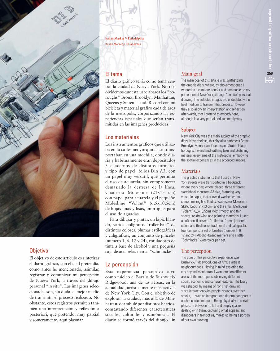
Los materialesLos instrumentos gráficos que utiliza-ba en la calles neoyorquinas se trans-portaban en una mochila, donde dia-ria y habitualmente eran depositados 3 cuadernos de distintos formatos y tipo de papel: folios Din A3, con un papel muy versátil, que permitía el uso de acuarela, sin comprometer demasiado la destreza de la línea, Cuaderno Moleskine (21x13 cm) con papel para acuarela y el pequeño Moleskine “Volant” (6,5x10,5cm) de hojas finas y lisas, impropias para el uso de aguadas.
Para dibujar y pintar, un lápiz blan-do, varios bolígrafos “roller-ball” de distintos colores, plumas estilográficas y caligráficas, un conjunto de pinceles (numero 1, 6, 12 y 24), rotuladores de tinta a base de alcohol y una pequeña caja de acuarelas marca “schmincke”.
La percepción Esta experiencia perceptiva tuvo como núcleo el Barrio de Bushwick/Ridgewood, una de las aéreas, en la actualidad, artísticamente más activas de New York City. Con el objetivo de explorar la ciudad, más allá de Man-hattan, deambulé por distintos barrios, constatando diferentes características sociales, culturales y económicas. El diario se formó través del dibujo “in
Main goalThe main goal of this article was synthetizing the graphic diary, where, as abovementioned I wanted to assimilate, render and communicate my perception of New York, through “on site” personal drawing. The selected images are undoubtedly the best medium to transmit that process. However, they also allow an interpretation and reflection afterwards, that I pretend to embody here, although in a very partial and summarily way.
Subject New York City was the main subject of the graphic diary. Nevertheless, this city also embraces Bronx, Brooklyn, Manhattan, Queens and Staten Island boroughs. I wandered with my bike and sketching material every area of the metropolis, embodying the spatial experiences in the produced images.
Materials The graphic instruments that I used in New York streets were transported in a backpack, where every day, where placed, three different sketchbooks: custom A3 size, featuring very versatile paper, that allowed washes without compromising line fluidity, watercolor Moleskine Sketchbook (21x13 cm) and the small Moleskine “Volant” (6,5x10,5cm), with smooth and thin sheets. As drawing and painting materials, I used a soft pencil, several “roller-ball” pens (different colors and thickness), traditional and calligraphic fountain pens, a set of brushes (number 1, 6, 12 and 24), Alcohol-based markers and a little “Schmincke” watercolor pan set.
The perception The core of this perceptive experience was Bushwick/Ridgewood, one of NYC´s artiest neighbourhoods. Having in mind exploring the city beyond Manhattan, I wandered on different areas of the metropolis, observing different social, economic and cultural features. The Diary was shaped, by means of “on site” drawing, since interaction with people, sounds, weather, smells,… was an integrant and determinant part in each recorded moment. Being physically in certain places, in between its full and empty spaces, dealing with them, capturing what appears and disappears in front of us, makes us being a portion of our own drawing.
italian Market // philadelphia
Italian Market // Philadelphia
260
1
261
expresión gráfica arquitectónica
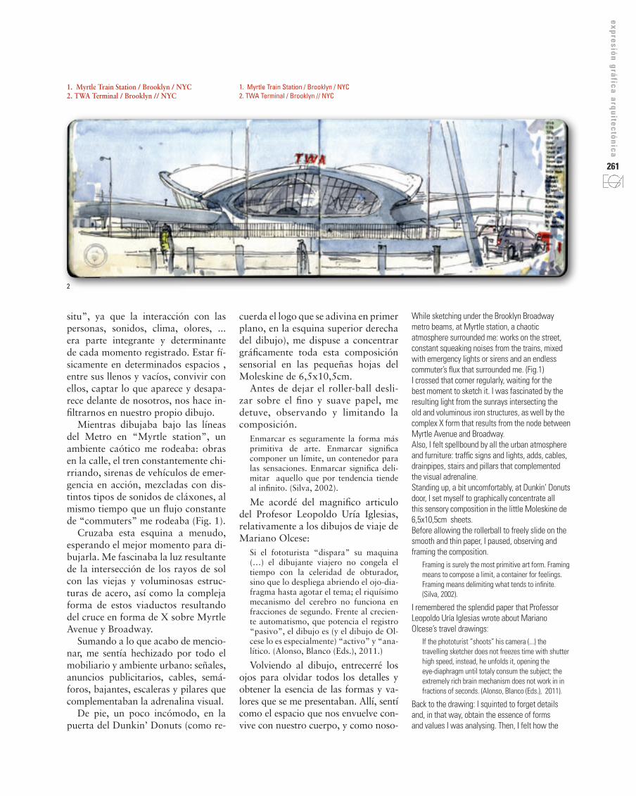
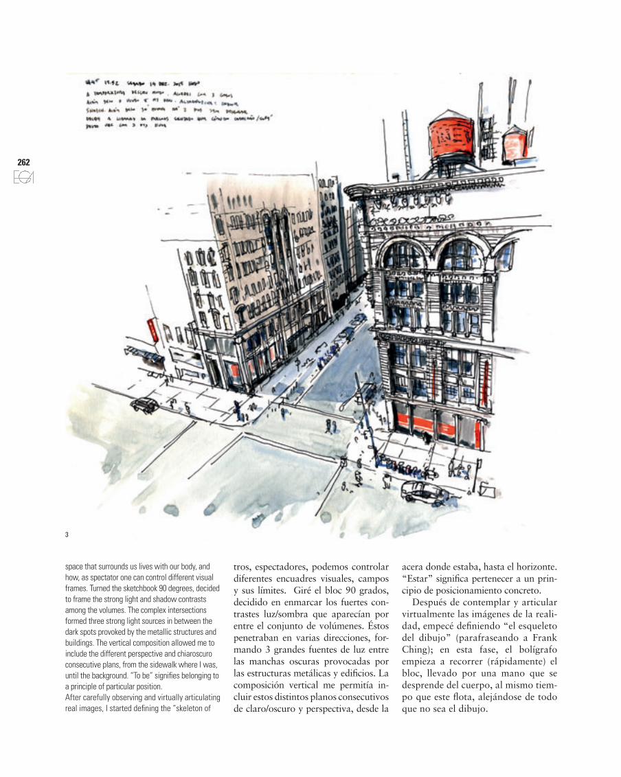
1. Myrtle Train Station / Brooklyn / NYC2. TWA Terminal / Brooklyn // NYC
1. Myrtle Train station / Brooklyn / NYC2. TWa Terminal / Brooklyn // NYC
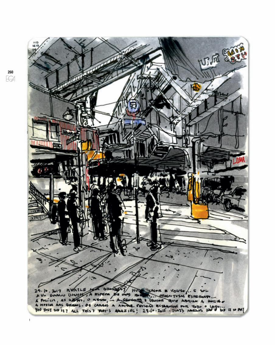
While sketching under the Brooklyn Broadway metro beams, at Myrtle station, a chaotic atmosphere surrounded me: works on the street, constant squeaking noises from the trains, mixed with emergency lights or sirens and an endless commuter’s flux that surrounded me. (Fig.1)I crossed that corner regularly, waiting for the best moment to sketch it. I was fascinated by the resulting light from the sunrays intersecting the old and voluminous iron structures, as well by the complex X form that results from the node between Myrtle Avenue and Broadway.Also, I felt spellbound by all the urban atmosphere and furniture: traffic signs and lights, adds, cables, drainpipes, stairs and pillars that complemented the visual adrenaline. Standing up, a bit uncomfortably, at Dunkin’ Donuts door, I set myself to graphically concentrate all this sensory composition in the little Moleskine de 6,5x10,5cm sheets. Before allowing the rollerball to freely slide on the smooth and thin paper, I paused, observing and framing the composition.
Framing is surely the most primitive art form. Framing means to compose a limit, a container for feelings. Framing means delimiting what tends to infinite. (Silva, 2002).
I remembered the splendid paper that Professor Leopoldo Uría Iglesias wrote about Mariano Olcese’s travel drawings:
If the phototurist “shoots” his camera (...) the travelling sketcher does not freezes time with shutter high speed, instead, he unfolds it, opening the eye-diaphragm until totaly consum the subject; the extremely rich brain mechanism does not work in in fractions of seconds. (Alonso, Blanco (Eds.), 2011).
Back to the drawing: I squinted to forget details and, in that way, obtain the essence of forms and values I was analysing. Then, I felt how the
cuerda el logo que se adivina en primer plano, en la esquina superior derecha del dibujo), me dispuse a concentrar gráficamente toda esta composición sensorial en las pequeñas hojas del Moleskine de 6,5x10,5cm.
Antes de dejar el roller-ball desli-zar sobre el fino y suave papel, me detuve, observando y limitando la composición.
Enmarcar es seguramente la forma más primitiva de arte. Enmarcar significa componer un límite, un contenedor para las sensaciones. Enmarcar significa deli-mitar aquello que por tendencia tiende al infinito. (Silva, 2002).
Me acordé del magnifico articulo del Profesor Leopoldo Uría Iglesias, relativamente a los dibujos de viaje de Mariano Olcese:
Si el fototurista “dispara” su maquina (…) el dibujante viajero no congela el tiempo con la celeridad de obturador, sino que lo despliega abriendo el ojo-dia-fragma hasta agotar el tema; el riquísimo mecanismo del cerebro no funciona en fracciones de segundo. Frente al crecien-te automatismo, que potencia el registro “pasivo”, el dibujo es (y el dibujo de Ol-cese lo es especialmente) “activo” y “ana-lítico. (Alonso, Blanco (Eds.), 2011.)
Volviendo al dibujo, entrecerré los ojos para olvidar todos los detalles y obtener la esencia de las formas y va-lores que se me presentaban. Allí, sentí como el espacio que nos envuelve con-vive con nuestro cuerpo, y como noso-
situ”, ya que la interacción con las personas, sonidos, clima, olores, ... era parte integrante y determinante de cada momento registrado. Estar fí-sicamente en determinados espacios , entre sus llenos y vacíos, convivir con ellos, captar lo que aparece y desapa-rece delante de nosotros, nos hace in-filtrarnos en nuestro propio dibujo.
Mientras dibujaba bajo las líneas del Metro en “Myrtle station”, un ambiente caótico me rodeaba: obras en la calle, el tren constantemente chi-rriando, sirenas de vehículos de emer-gencia en acción, mezcladas con dis-tintos tipos de sonidos de cláxones, al mismo tiempo que un flujo constante de “commuters” me rodeaba (Fig. 1).
Cruzaba esta esquina a menudo, esperando el mejor momento para di-bujarla. Me fascinaba la luz resultante de la intersección de los rayos de sol con las viejas y voluminosas estruc-turas de acero, así como la compleja forma de estos viaductos resultando del cruce en forma de X sobre Myrtle Avenue y Broadway.
Sumando a lo que acabo de mencio-nar, me sentía hechizado por todo el mobiliario y ambiente urbano: señales, anuncios publicitarios, cables, semá-foros, bajantes, escaleras y pilares que complementaban la adrenalina visual.
De pie, un poco incómodo, en la puerta del Dunkin’ Donuts (como re-
2
262
space that surrounds us lives with our body, and how, as spectator one can control different visual frames. Turned the sketchbook 90 degrees, decided to frame the strong light and shadow contrasts among the volumes. The complex intersections formed three strong light sources in between the dark spots provoked by the metallic structures and buildings. The vertical composition allowed me to include the different perspective and chiaroscuro consecutive plans, from the sidewalk where I was, until the background. “To be” signifies belonging to a principle of particular position. After carefully observing and virtually articulating real images, I started defining the “skeleton of
3
tros, espectadores, podemos controlar diferentes encuadres visuales, campos y sus límites. Giré el bloc 90 grados, decidido en enmarcar los fuertes con-trastes luz/sombra que aparecían por entre el conjunto de volúmenes. Éstos penetraban en varias direcciones, for-mando 3 grandes fuentes de luz entre las manchas oscuras provocadas por las estructuras metálicas y edificios. La composición vertical me permitía in-cluir estos distintos planos consecutivos de claro/oscuro y perspectiva, desde la
acera donde estaba, hasta el horizonte. “Estar” significa pertenecer a un prin-cipio de posicionamiento concreto.
Después de contemplar y articular virtualmente las imágenes de la reali-dad, empecé definiendo “el esqueleto del dibujo” (parafraseando a Frank Ching); en esta fase, el bolígrafo empieza a recorrer (rápidamente) el bloc, llevado por una mano que se desprende del cuerpo, al mismo tiem-po que este flota, alejándose de todo que no sea el dibujo.
263
expresión gráfica arquitectónica
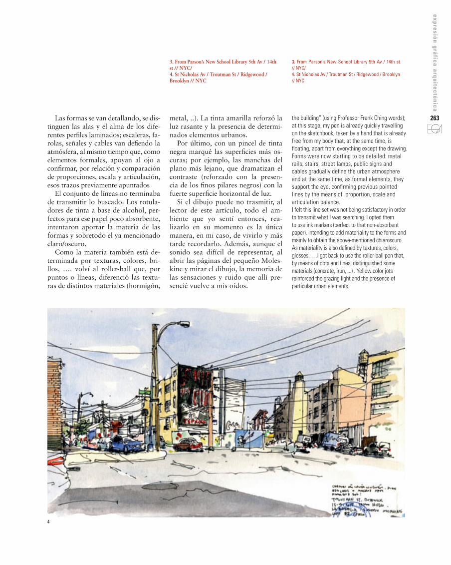
3. From parson’s New school library 5th av / 14th st // NYC/4. st Nicholas av / Troutman st / ridgewood / Brooklyn // NYC
3. From Parson’s New School Library 5th Av / 14th st // NYC/4. St Nicholas Av / Troutman St / Ridgewood / Brooklyn // NYC
the building” (using Professor Frank Ching words); at this stage, my pen is already quickly travelling on the sketchbook, taken by a hand that is already free from my body that, at the same time, is floating, apart from everything except the drawing. Forms were now starting to be detailed: metal rails, stairs, street lamps, public signs and cables gradually define the urban atmosphere and at the same time, as formal elements, they support the eye, confirming previous pointed lines by the means of proportion, scale and articulation balance. I felt this line set was not being satisfactory in order to transmit what I was searching. I opted them to use ink markers (perfect to that non-absorbent paper), intending to add materiality to the forms and mainly to obtain the above-mentioned chiaroscuro. As materiality is also defined by textures, colors, glosses, …I got back to use the roller-ball pen that, by means of dots and lines, distinguished some materials (concrete, iron, ...) . Yellow color jots reinforced the grazing light and the presence of particular urban elements.
metal, ..). La tinta amarilla reforzó la luz rasante y la presencia de determi-nados elementos urbanos.
Por último, con un pincel de tinta negra marqué las superficies más os-curas; por ejemplo, las manchas del plano más lejano, que dramatizan el contraste (reforzado con la presen-cia de los finos pilares negros) con la fuerte superficie horizontal de luz.
Si el dibujo puede no trasmitir, al lector de este artículo, todo el am-biente que yo sentí entonces, rea-lizarlo en su momento es la única manera, en mi caso, de vivirlo y más tarde recordarlo. Además, aunque el sonido sea difícil de representar, al abrir las páginas del pequeño Moles-kine y mirar el dibujo, la memoria de las sensaciones y ruido que allí pre-sencié vuelve a mis oídos.
Las formas se van detallando, se dis-tinguen las alas y el alma de los dife-rentes perfiles laminados; escaleras, fa-rolas, señales y cables van defiendo la atmósfera, al mismo tiempo que, como elementos formales, apoyan al ojo a confirmar, por relación y comparación de proporciones, escala y articulación, esos trazos previamente apuntados
El conjunto de líneas no terminaba de transmitir lo buscado. Los rotula-dores de tinta a base de alcohol, per-fectos para ese papel poco absorbente, intentaron aportar la materia de las formas y sobretodo el ya mencionado claro/oscuro.
Como la materia también está de-terminada por texturas, colores, bri-llos, …. volví al roller-ball que, por puntos o líneas, diferenció las textu-ras de distintos materiales (hormigón,
4
264 Finally, using a black ink brush, I stressed the darker surfaces, like the black patches on the background, which dramatized the sharp contrast (reinforced by the presence of the thin black pillars) with the strong horizontal light. Even though the drawing may not transmit, to the reader of this paper, all the mood I felt back then, drawing , in that precise moment, is the only way, in my case, of “living” it and later remember. Besides, although sound is hard to represent, every time I open the pages of the little Moleskine and watch the drawing, the sounds and sensations felt back then, return into my mind. Eero Saarinen’s TWA terminal is another image from New York that was travelling in my memory for years. (Fig. 2)I crossed that building several times, until one morning, very early, coming from Florida, when the organic shape was presented to me under a perfect light to paint. Besides, that point of view, from JFK’s terminal 5, allowed me visualizing the transparent and complex intern structure of the TWA.
We should admit that placing ourselves in a point or another changes the perception of the architecture embodying the subjectivity of the personal vision. (…) Choosing the point of view is transformed in a fundamental point of the sketcher’s work, maybe the most important, if we consider that all the posterior decisions are conditioned by this first one. (Báez Mezquita. 2011).
The horizontal shape of the building made me force the perspective beyond my vision cone, resulting in a very wide frame. As I said before, the morning light I felt back then invited to watercolor the drawing. Whitish forms stood out over that blue sky scenario (The architects Álvaro Siza or Santiago Calatrava masterly control this phenomenon in Iberian Peninsula). Paradoxically, these surfaces, that most contributed to define the building mass, were exactly the ones I would not paint (the “white”); I stop for a while to observe and assimilate those magical surfaces I DO NOT want to cover. Afterwards, grey shadows were drawn to serve this particular voids (whites) providing them shape and volume. Several other grey tone levels were then combined in order to articulate all the different plans of the interior domes, in between the reflections and transparencies of the big elliptical window. All impressions, in each drawing, are recorded in my memory and after the sketching process,
Totalmente distinto fue el momen-to en el barrio judío de Williamsburg, donde rodeado de gente de todas la edades, con sus trajes y lengua parti-culares, que curiosos miraban el dibu-jo, me sentí transportado a otro mun-do físico y cultural. (Fig. 2)
El terminal TWA de Eero Saarinen es otra imagen de nueva York que via-jaba en mi memoria, esta desde hace muchos años. (Fig. 3)
Me crucé con la obra un par de veces, hasta que una mañana, muy pronto, al salir del Terminal 5 de JFK, volviendo de Florida, que la orgánica figura se me presentó bajo una luz perfecta.
Además, el punto de vista me permi-tía visualizar la transparente y comple-ja estructura interna de la terminal.
Debemos admitir que situarnos en una posición u otra altera la percepción de la arquitectura al incorporar la subjetivi-dad propia de la visión única”. (…) “La elección del punto de vista se convierte en un aspecto fundamental del trabajo del dibujante, quizás el más importan-te, si pensamos que todas las decisiones posteriores están condicionadas por ésta primera. (Báez Mezquita. 2011).
La forma alargada del edificio me obligó a forzar la perspectiva más para allá de mi cono de visión.
La luz suave de la mañana me in-vitó a acuarelar el dibujo. Las formas blanquecinas se destacaban sobre el escenario del cielo azul, fenómeno que bien conocemos en la Península Ibéri-ca y tan manejado por Álvaro Siza o Santiago Calatrava en sus proyectos. Paradójicamente, esas superficies, las que más contribuirían para definir la masa del edificio serían justamente las que dejaría por pintar (el “blanco”); me detengo unos instantes para ob-servar y asimilar esas superficies má-gicas que NO pretendo manchar en mi Bloc. Posteriormente, las sombras grises se dibujaron al servicio de estos
mismos vacíos (blancos), aportándo-les forma y volumen. Varios niveles de tonos gris se combinaron para articu-lar las distintos planos de las bóvedas interiores, entre los reflejos y transpa-rencias de la gran vidriera.
ConclusionesTrasladándonos de los ejemplos co-mentados a otra perspectiva más ge-neral, arriesgo afirmar que las impre-siones que, en cada uno de mis dibu-jos, quedan inscritas en mi memoria tras el proceso del dibujo, pasan a formar parte de mi bagaje cognosciti-vo personal y muy probablemente se perderían al no ser registradas.
Además, adoptando los conceptos de Norberg-Schulz, al dibujar, mi per-cepción de los objetos representados (“nivel de objetos”) fue inconsciente-mente ampliándose, desde una percep-ción más superficial de los fenómenos a otra más detallada. El arquitecto no-ruego defendía que “La psicología de la percepción nos enseña a rechazar el realismo ingenuo. El mundo no “es” como inmediatamente se nos aparece, debemos tener en cuenta siempre que nuestras percepciones pueden ser su-perficiales o incluso equivocadas”.
También según el Profesor Francis Ching, “Práctica regular y continua es necesaria para aprender dibujar, lo cual en realidad se trata de aprender a ver.” (…) Dibujar nos anima para tomar el tiempo para prestar aten-ción a las cosas y las relaciones que suelen pasar desapercibidas.” (Ba-rros, Hidalgo. 2015)
Como ya parcialmente menciona-do, el clima fue también un elemento condicionante y consecuentemente, parte integrante de los dibujos diarios. La búsqueda del calor, la luz del Sol, o de espacios interiores, cuando el frio apretaba, dictaban a menudo los te-
265
expresión gráfica arquitectónica
mas, ambiente, composiciones o tipos de perspectiva a dibujar. (Fig. 3)
De lo anterior se desprende que es-pacio, tiempo, clima y determinado ambiente urbano definen cada uno de los dibujos que resultan de la obser-vación y representación de momentos específicos e identidades de distintas comunidades en ámbitos socio-cultu-rales concretos. En su conjunto ter-mina por formar un pequeño relato antropológico inscrito en las páginas de este diario gráfico.
Como complemento, expongo otros dibujos realizados en Nueva York: me gustaría que pudieran co-municar algo más que mis palabras, vincular el lector a los momentos di-bujados y hacerlo cuestionar ¿porqué hacer imágenes, porqué dibujar? n
Referencias– BARROS E COSTA, H., & Delgado, F.
(2015). Conversando con... Frank D.K. Ching. EGA. Revista de expresión gráfica ar-quitectónica, 25, 20-31.
– BÁEz MEzQUITA, J. M. (2011). La arqui-tectura de los dioses. Dibujando en Paestum. EGA. Revista de expresión gráfica arquitectó-nica, 18, 192-201.
– CHING, Francis D.K. 2012. Dibujo y Proyec-to, ed. Gustavo Gili. Barcelona
– MCQUAID, M. 2002 Envisioning architecture. Acquiring architecture: building a modern collec-tion. Drawings of the Museum of Modern Art. New York: the Museum of Modern Art , p. 19.
– NYMUNARI, B., & CIRLOT, J. E. 1968. El arte como oficio. ed. Gustavo Gili. Barcelona
– NORBERG-SCHULz, C. 2005. Los principios de la arquitectura moderna: sobre la nueva tra-dición del siglo xx (Vol. 7). Reverté.
– NORBERG-SCHULz, C. 1979. Intenciones en arquitectura.
– RECHT, Roland. 1995. Le desin d’architecture. Adam Biro. Paris. pag. 9
– SILVA, Vítor Manuel Oliveira. 2002. Relatório da disciplina de Desenho da Arquitectura. FAUP.
– JESÚS, I., ALONSO, S. J., & BLANCO, M. Ú. (Eds.). 2011. Leopoldo Uría Iglesias: Represen-tación y proyecto Gráfico: escritos de arquitec-tura. Universidad de Valladolid, Secretariado de Publicaciones e Intercambio Editorial.
Más dibujos relacionados con el articulo pueden ser consultados en mi blog www.hugobrc.wordpress.com en la categoría “NY”.
become part of my cognitive luggage; very probably they would get lost if not registered. Appropriating Norberg-Schulz’s concepts, when drawing, my perception of the represented objects (“object levels”) is unconsciously broadened, from a superficial phenomenon perception to a more detailed one. The Norwegian architect defended that the “Psychology of the perception teach us to reject the ingenuous realism. The World “is” not as immediately appears to us, we should always bear in mind that our perceptions can superficial or even mistaken.”Also, according Professor Francis Ching, “Regular and continuous practice is necessary to learn how to draw. Which is really about learning how to see.(…) Drawing encourages us to take the time to pay attention to things and relationships that might normally pass unnoticed.” New York City’s climate was also a conditioning element and consequentially, integral part of the daily sketches. Searching Sun light heat or indoor spaces when cold was hard too support, very often dictated the subjects, compositions or perspective features. (Fig 3.) In this way, space, form, time and particular urban environment defined each one of the drawings, which resulted from the observation and representation of specific moments and identities of different communities, in concrete social-cultural environment. As a whole, this graphic diary ends up forming a modest anthropologic
chronicle of certain Big Apple’s areas. In addition, I display some other New York City’s drawings, wishing they could communicate much more than these words, link the reader to the sketched moments and maybe raise the question why producing images, why drawing? n
references– BARROS E COSTA, H., & Delgado, F. (2015). Conversando
con... Frank D.K. Ching. EGA. Revista de expresión gráfica arquitectónica, 25, 20-31.
– BÁEz MEzQUITA, J. M. (2011). La arquitectura de los dioses. Dibujando en Paestum. EGA. Revista de expresión gráfica arquitectónica, 18, 192-201.
– CHING, Francis D.K. 2012. Dibujo y Proyecto, ed. Gustavo Gili. Barcelona
– MCQUAID, M. 2002 Envisioning architecture. Acquiring architecture: building a modern collection. Drawings of the Museum of Modern Art. New York: the Museum of Modern Art , p. 19.
– NYMUNARI, B., & CIRLOT, J. E. 1968. El arte como oficio. ed. Gustavo Gili. Barcelona
– NORBERG-SCHULz, C. 2005. Los principios de la arquitectura moderna: sobre la nueva tradición del siglo xx (Vol. 7). Reverté.
– NORBERG-SCHULz, C. 1979. Intenciones en arquitectura.– RECHT, Roland. 1995. Le desin d’architecture. Adam Biro.
Paris. pag. 9– SILVA, Vítor Manuel Oliveira. 2002. Relatório da disciplina
de Desenho da Arquitectura. FAUP. – JESÚS, I., ALONSO, S. J., & BLANCO, M. Ú. (Eds.). 2011.
Leopoldo Uría Iglesias: Representación y proyecto Gráfico: escritos de arquitectura. Universidad de Valladolid, Secretariado de Publicaciones e Intercambio Editorial.
Más dibujos relacionados con el articulo pueden ser consultados en mi blog www.hugobrc.wordpress.com en la categoría “NY”.
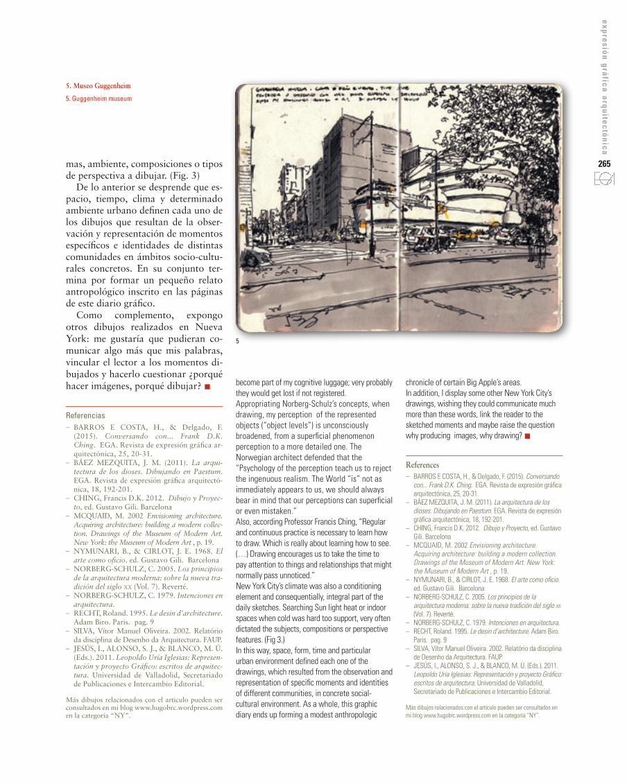
5. Museo guggenheim
5. Guggenheim museum
5
6
7
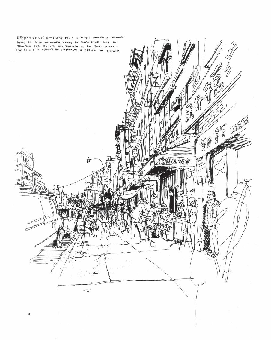
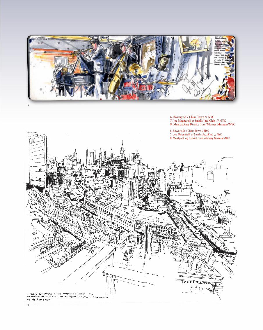
6. Bowery st. / China Town // NYC7. Joe Magnarelli at smalls Jazz Club // NYC8. Meatpacking District from Whitney Museum/NYC
6. Bowery St. / China Town // NYC7. Joe Magnarelli at Smalls Jazz Club // NYC8. Meatpacking District from Whitney Museum/NYC
8